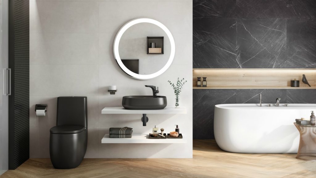
Is the clinical, white bathroom set to be a dim and distant memory as bathroom décor welcomes an explosion of colour? And will this mean a return to Avocado?
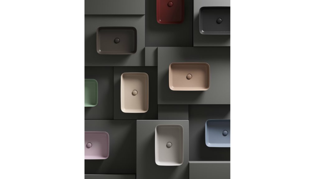
Introducing two dish-shaped basins at ISH, Terra and Aqua were added to the Alape portfolio. Terra features a matt, powdery surface in pastel colour nuances (shown), while Aqua has a transparent surface reminiscent of glass in dark blue and green hues
At the global bathroom exhibition ISH there was a riot of colour, splashed not only across furniture but brassware, baths and even ceramics.
Spanning pastels and candy colours, through to earthy tones and bold and dark industrial finishes, it was an antithesis to clinical, white environments that have dominated modern bathroom aesthetics.
Sponsored Video
Industry experts agree the UK consumer is ready for the return of colour, as director of Waters Baths of Ashbourne Lee Frost explains why: “Just as the psychedelic 1970s were a reaction against the modernists of the 1960s, we are now witnessing bold prints and vivid colours take hold of the interiors industry, after a long period of minimalism.
“There is also something incredibly comforting about maximalist interiors, particularly in today’s world where achieving everything seems so uncertain and fast-paced – colourful interiors are warming and homely.”
Advantages of colour
Designed by Milan-based Terri Pecora, the Plural collection from VitrA features coloured sanitaryware in Matt Taupe, Matt Mink and Matt Black. These join Matt White and White finishes.
This move away from white means is beneficial to designers on a number of levels. It not only allows them to create individual spaces for clients, but allows customers to have a greater input into the design process.
And the use of colour in the showroom, can reflect this design ethos, while providing stand-out appeal on the high street.
Marketing manager of VitrA Margaret Talbot continues: “Many UK consumers thoroughly enjoy the process of shopping for personal bathroom pieces.
“They love the look and feel of modern colours and textures and see themselves as architects of their own space.
“Any stand out colour displayed in bathroom showrooms is intriguing to end users and attracts potential buyers into bricks and mortar businesses.”
Head of marketing at Bette Sven Resinghoff agrees: “The return of colour gives everyone the opportunity to become more creative and add personality to the bathroom. Retailers have the opportunity to create more interesting displays to make their showroom stand out.”
Using splashes
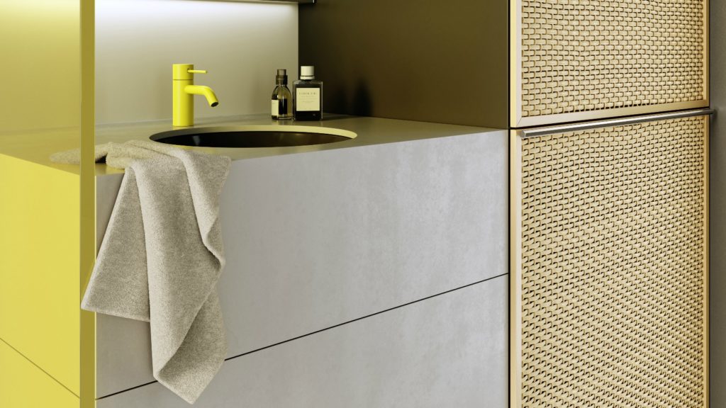
The Meta mixer from Dornbract is available in three variants Meta, Meta Slim and Meta Pure. It comes in a choice of three Fashion colours pale green, yellow, light pink and grey-blue, three Architectural finishes and three Urban finishes
But how should bathroom designers be using colour to attract discerning fashion-led clientele and volume sales in the mass market?
Industry experts suggest a splash of colour across furniture and brassware will allow consumers to play with colour without having to commit to a fashionable interior that may date.
Sales and marketing director of Frontline Bathrooms Michael Sammon says: “We believe coloured bathrooms will be largely contained to furniture and brassware that are simple to replace and change.”
And senior category manager for Grohe UK Paul Bailey agrees “coloured brassware is an up-and-coming addition for the bathroom that looks set to become a popular way of adding colour and personalisation into bathroom design.
“You can use coloured brassware as much or as little as you wish, from just small pops of colour in flush plates or accessories or by co-ordinating the entire bathroom to include showers and taps too.”
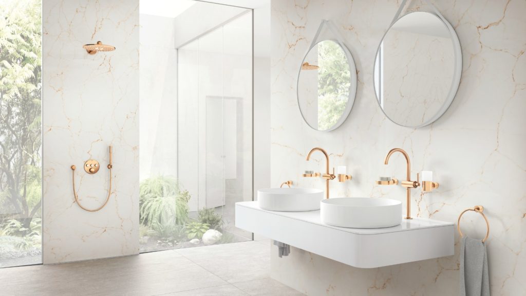
At the recent ISH bathroom exhibition Grohe showed Perfect Match, demonstrating the use of a finish across all brassware, including waste traps and shower hoses. Altrio is shown in a Polished Warm Sunset finish
However, for consumers who may be more confident with colour, basins and freestanding baths can provide a real splash.
Sven Resinghoff of Bette says: “In ensuites, the use of a coloured basin can provide the pop of colour to help elevate the room into something special, while in the main bathroom one of the strongest uses of colour will be freestanding baths.”
As part of its first collaboration with Palomba Serafini Associati, Ideal Standard unveiled its Ipalyss basins. The colours were based on the heritage of the company’s portfolio
And marketing manager at BC Designs Sally Cutchie agrees: “There are ways of adding colour which don’t have to be as permanent as adding a pink bathroom suite.
“Choosing your pieces carefully can make sure colour is added but with the ability to adapt to trends. One example is our painted boat bath, which we’ve seen a 70% increase in orders across the last couple of years.
“It fits the brief for colour personalisation and, what is great is, once a homeowner had had enough of the colour it can be repainted.”
Natural themes
With such an array of colours on offer to the bathroom designer, what palettes should they consider for on-trend interiors, meeting the needs of discerning, fashion-led clientele?
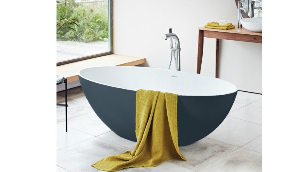
Bette offers its latest Craft basin and Oval Silhouette bath in Blue Satin but customers can choose from around 500 colours for any product. Like all Bette products, both the basin and bath are made from enamelled titanium steel
While Avocado won’t be making a comeback, industry experts believe colours inspired by nature –greens and blues – will be high on the agenda.
Sven Resinghoff comments: “Many different palettes will become popular over the coming years, but we think some of the most popular will be those that add a relaxing warmth to the bathroom, such as darker shades and also those that have been inspired by nature, such as greens and blues; calming colours that will help to satisfy our need for tranquillity in the bathroom.”
And commercial director at Merlyn Barry Hoyne agrees tranquil natural colours will be a big hit in the bathroom: “While bold colours are really making a statement, we feel the more earthy tones will prove more popular; spa-like serenity, natural woods, sage greens, beiges and greys.”
Water-inspired blue tones are already making headway in interior design says product manager of Showerwall Steph Harris: “Blue is the colour to watch this year in all shades from pale to cerulean to inky blue.
“It’s currently the go-to shade in wallcoverings, fabrics and soft furnishings and we have seen deep blues on painted kitchen furniture over the last year. This influence is now crossing over more in the bathroom.”
All Waters Baths of Ashbourne’s freestanding and back-to-wall baths and basins are now available in Farrow & Ball colours. From Sage Greens to warmer neutrals, each piece has a textured eggshell finish
Industrial inspiration
Running concurrently with the trend for nature inspired colours is the industrial theme, which has inspired a raft of alternative finishes to chrome brassware, such as brass and nickel.
One of Roca’s stories on its stand at ISH was the introduction of colours for ceramic, brassware and accessories. Beige, Coffee, Pearl and Onyx finishes were added to sanitaryware, while Everlux finishes for brassware were offered in Titanium Black, Rose Gold and Onyx
Managing director of Roman David Osborne says moving away from chrome makes business sense, commenting: “Over the last 10 years it has been about achieving bright silver finishes on shower enclosures.
“Now that’s achieved, even the cheapest Chinese products are coming in with acceptable bright silver finishes. Commercially there is no premium for bright silver anymore.”
Already offering shower enclosures and brassware in matt black and brushed nickel, Roman is set to launch polished nickel and brushed brass finishes this year.
And, of course, industrial themes support the use of grey which can complement on-trend blues and greens.
Sally Cutchie of BC Designs adds: “Greys, just like we’ve seen throughout interiors, will be a huge colour choice. Colour will also be combined with textures.
“We’re set to launch a concrete-inspired bath, which will be both colourful and have real impact. It also works well with Teal, which will be a huge colour in 2019 and into 2020.”
While, undoubtedly, there will be an on-trend palette, the beauty of colour is that’s subjective.
Sales director of Vogue UK Steve Birch concludes: “It should relate to your customer and how they want the product and space to look and feel.
“Every customer is different and so the best way to gain traction in the marketplace is to ensure open dialogue, with your customers as they will ultimately steer you towards what is standard, bespoke and even exclusive in terms of colour.”
Sintered stone manufacturer Neolith has launched Calacatta Roma and Cappadocia Sunset, inspired by nature and classical architecture, and for use in kitchens or bathrooms walls, floors, in gardens or facades.
They belong to The New Classtone and Fusioncollections which interpret marble and natural stone, respectively, and boast Neolith’s antibacterial NeolEAT technology.
Inspired by Ancient Rome, Calacatta Roma (pictured top) pays homage to Italian Carrara marble, with ochre and grey veins in a white background.
While the Cappadocia region, in central Turkey, with its rock formations formed by volcanoes and underground cities, has inspired Cappadocia Sunset (pictured below).
Just like all of Neolith’s surfaces, Calacatta Roma and Cappadocia Sunset are resistant to heat and atmospheric conditions, are 100% recyclable, and do not contain added quartz to their formulation.
Mar 14, 2024

JUST OUT: @AcquabellaBath has unveiled a choice of shower grate patterns for its Base and Arq shower trays… https://t.co/kMN83c40Qf
JUST OUT: @FrankeUK unveils Mythos single lever mixers in Swivel Spout and Pull-out Nozzle options. #kitchendesign https://t.co/TSKCAo5r0e
INTERVIEW: Sales and marketing director of @blumuk David Sanders on how the kitchen industry has changed post-pand… https://t.co/k9LIpUhhDF
NEWS: Challenging housing market is driving home improvements, finds new research by @HafeleUK #HomeImprovement… https://t.co/eMB7jludIm
NEWS: British manufacturer @kudosshowersltd acquired by European SanSwiss. #acquisition #manufacturers #bathrooms https://t.co/gpOv7jMevn
NEWS: @HafeleUK announces Richard Curtis as managing director. #newhire #appointment #leadership https://t.co/NP8U5ramOb
NEWS: @officialbikbbi names CT1 sealant manufacturer as corporate sponsor. #installation #installer https://t.co/8zsxs2HI3n
NEWS: @quookeruk named one of fastest-growing companies in North West. #business #Awards https://t.co/9zZ1ZDGrFI
RETAILER FOCUS: Managing director and design director of UK Kitchen Retailer of the Year @KitchensbyJSG Jim Geddes… https://t.co/JhL3vmxwbd
NEWS: Consumers are renovating for long term, with kitchens and bathrooms a priority, finds @HouzzUK… https://t.co/9VhoTUDI0B
PROFILE: Managing Director of Flair Showers Alan Wright talks about the relaunch of the company, creation of a Show… https://t.co/WDMPqDt2Uk
The new @blumuk carbon black LEGRABOX boasts beautifully slim drawer sides, bringing furniture onto trend, easily b… https://t.co/DrEXXWTyQb
NEWS: House of Fraser owner @FrasersGroupPLC enters strategic partnership with @ao, buying a stake in the online e… https://t.co/44N0O9bekn
NEWS: @HowdensJoinery awarded @WhichUK Best Buy for its rigid cabinets and handleless kitchens. #kitchen… https://t.co/rALz8XRHbv
NEWS: @grohe invites 800 guests from around the world to its Grohe X Professional event in Lisbon, Portugal.… https://t.co/2RGjDum980
JUST OUT: Home appliance brand Candy has unveiled the Rapido dishwasher, claimed to be the fastest and most spaciou… https://t.co/mbWn2pJp2C